QUEEN FACE
SERVICES PROVIDED:
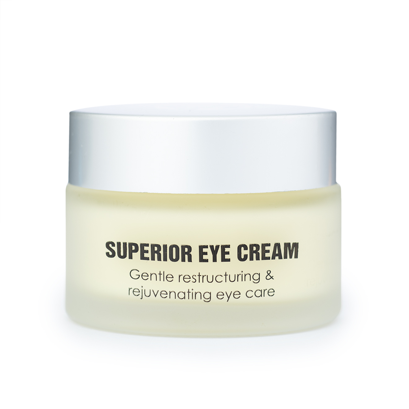
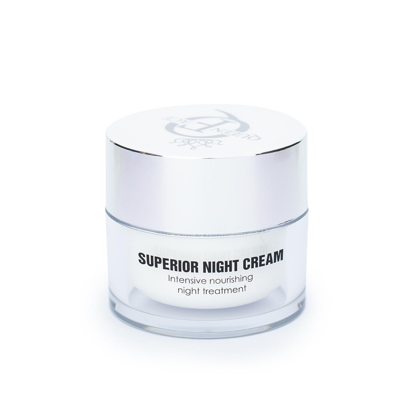
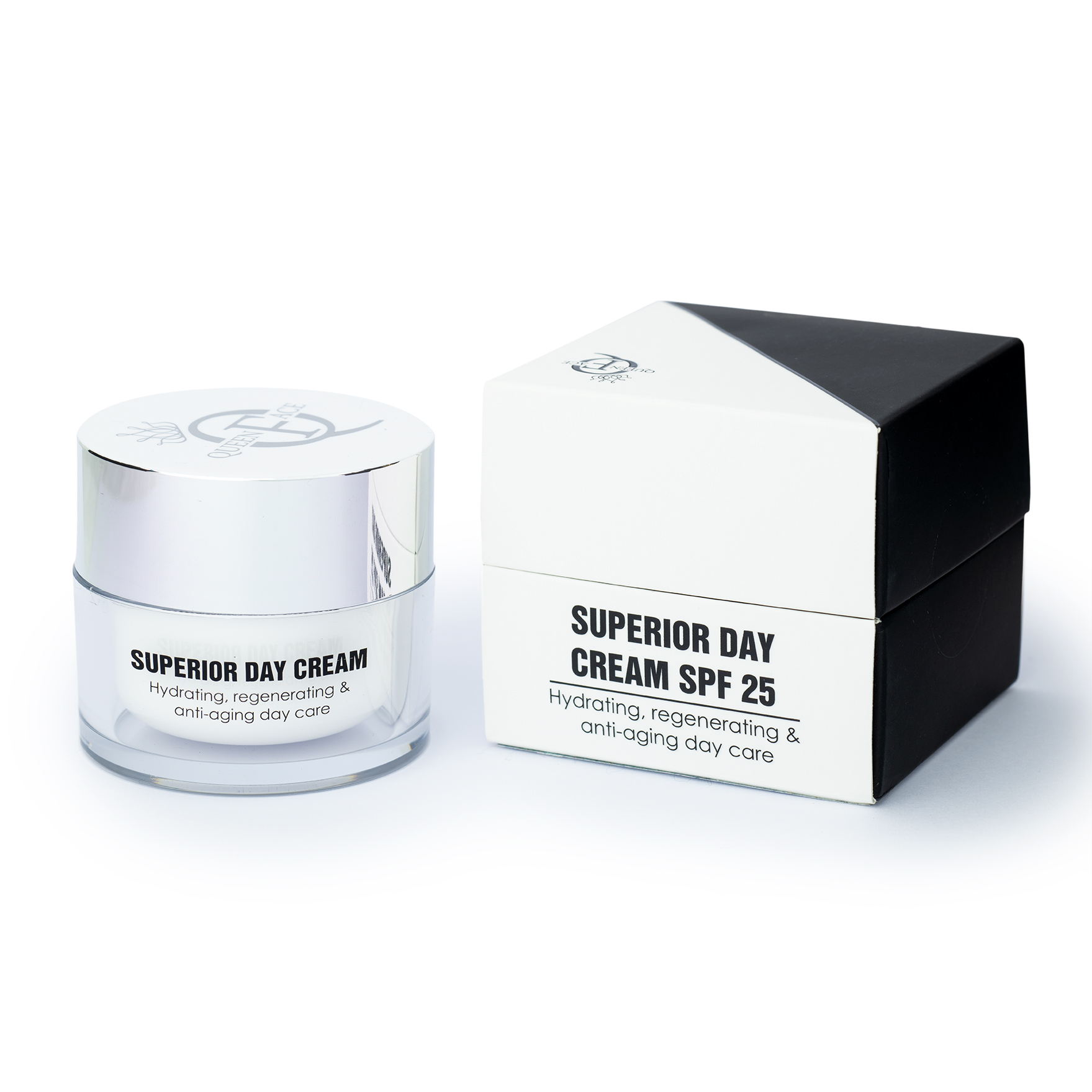
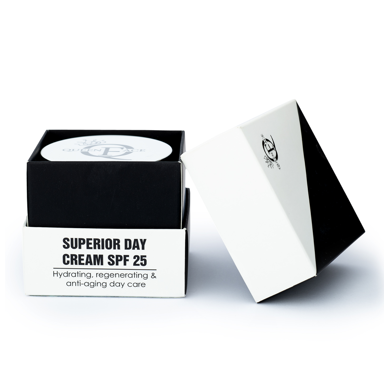
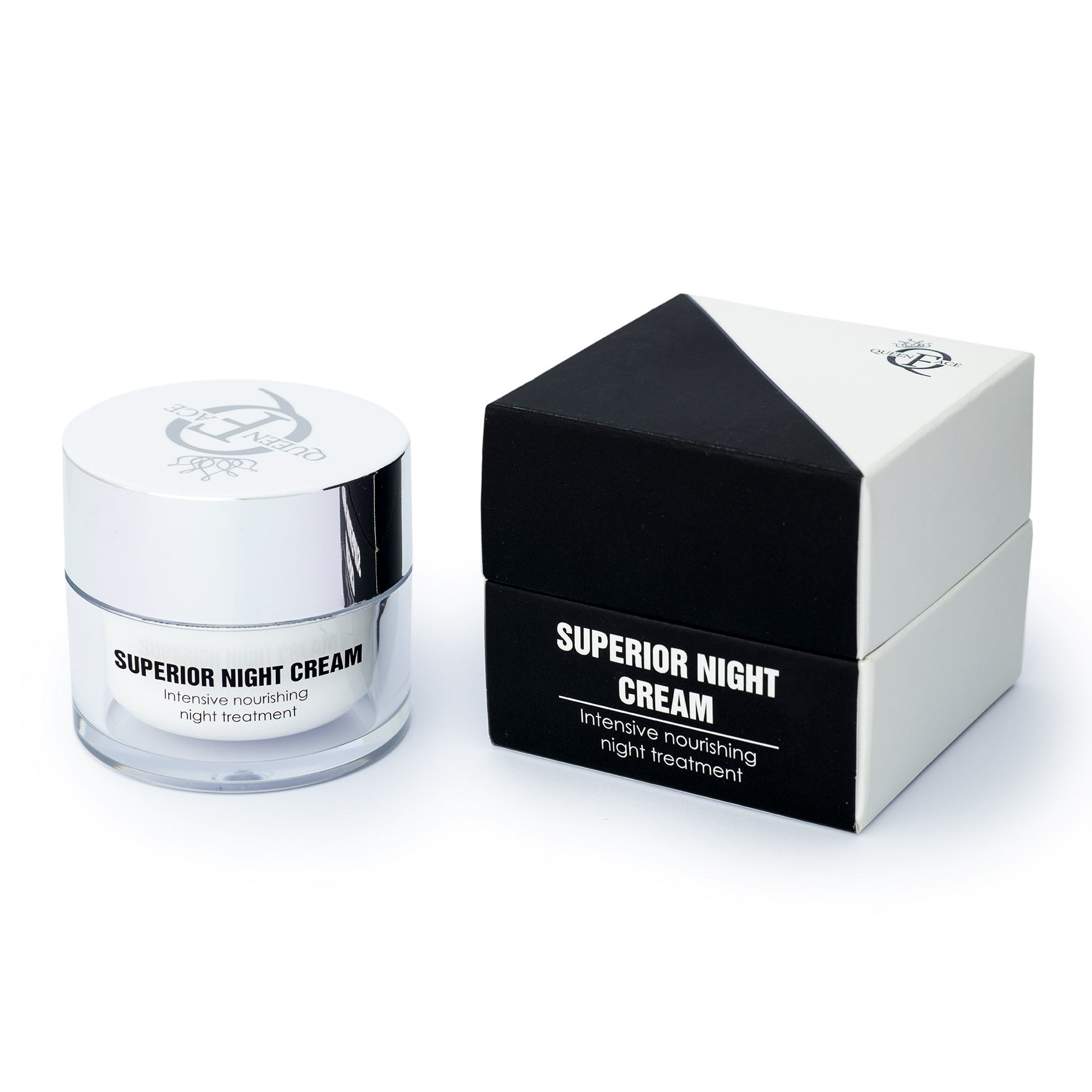
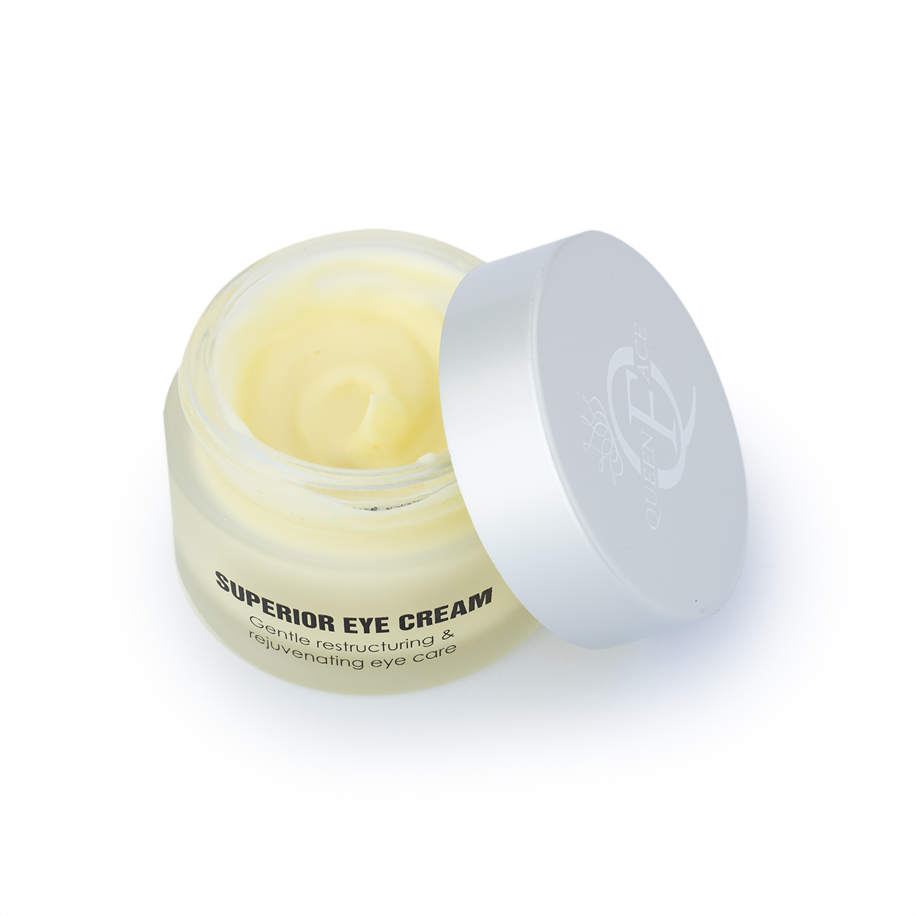
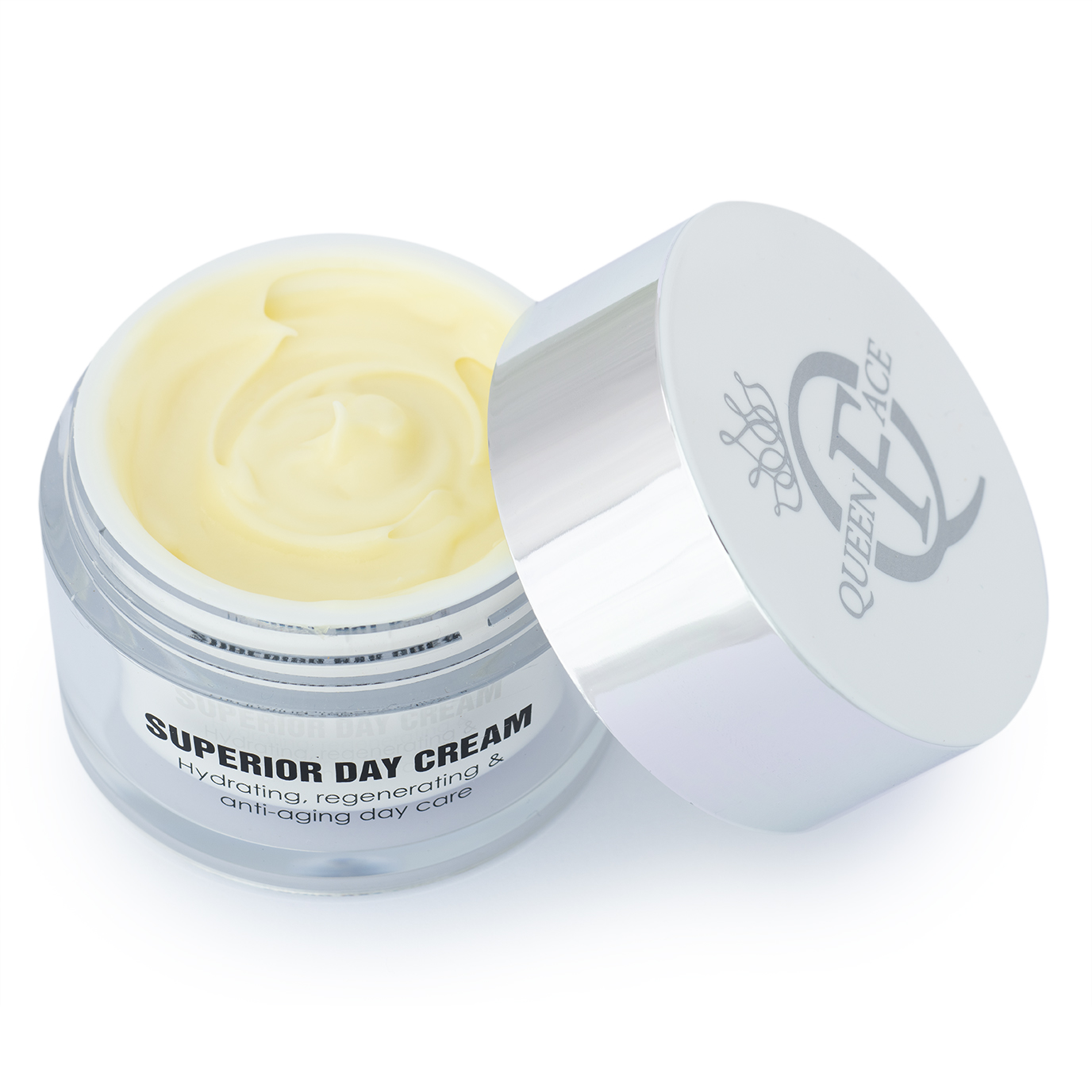
E-COMMERCE PACKSHOTS: High-end product photography on pure white background, focusing on packaging details and label readability.
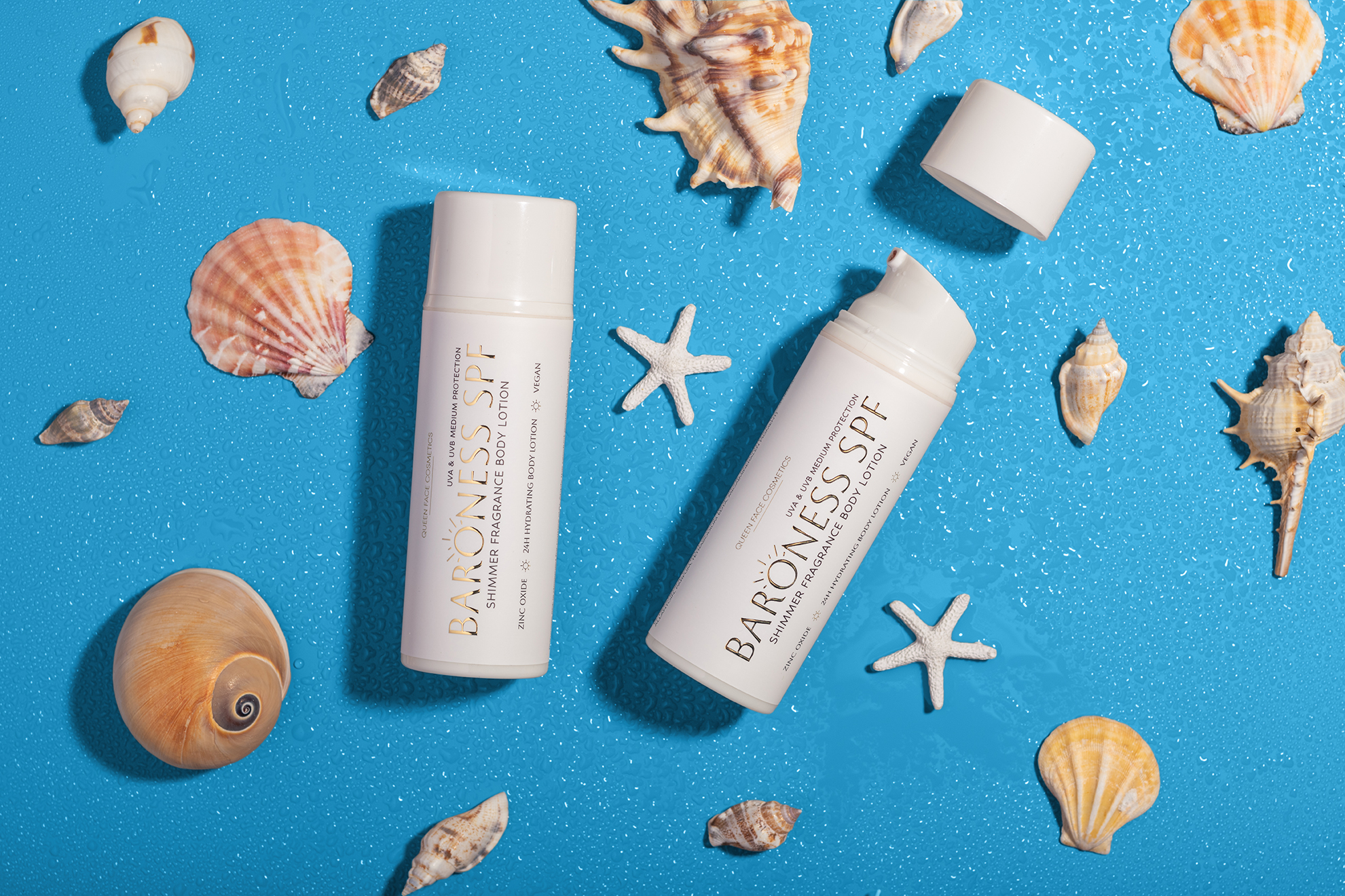
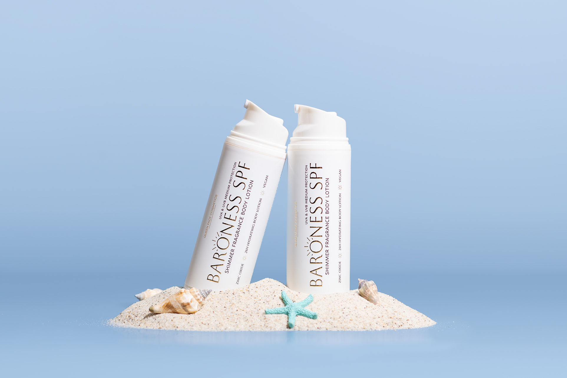
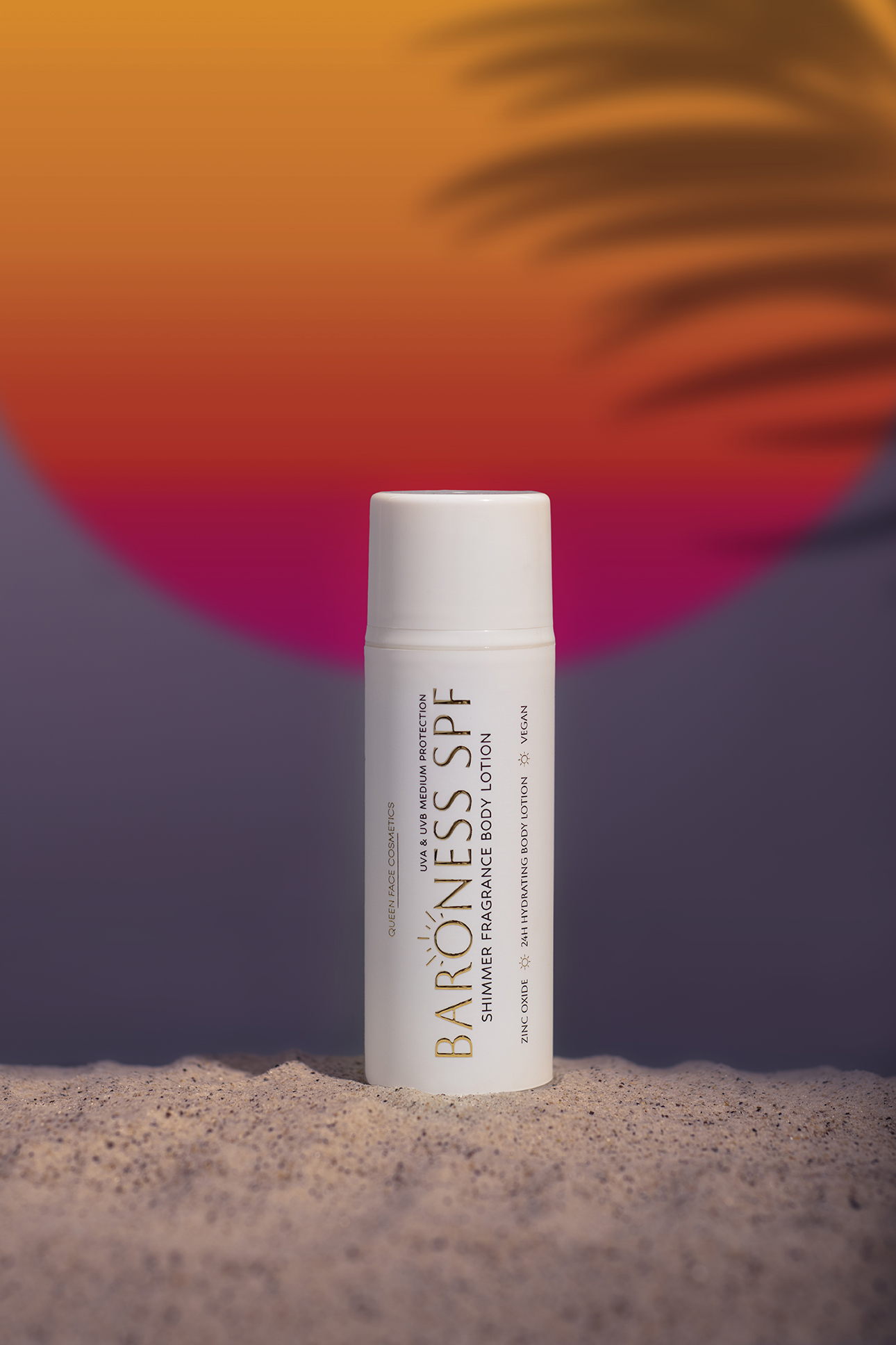
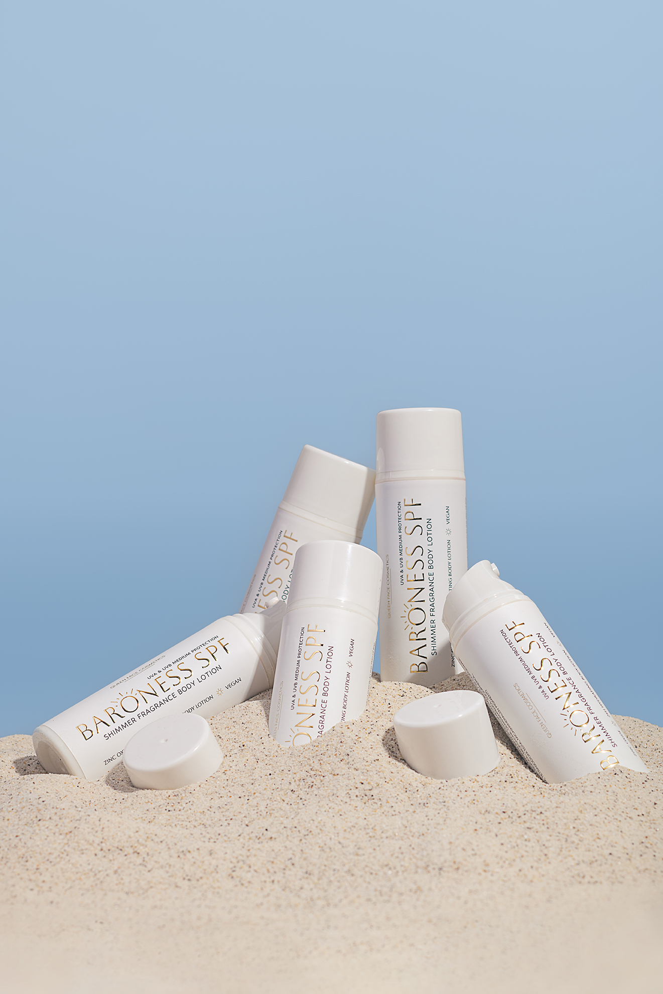
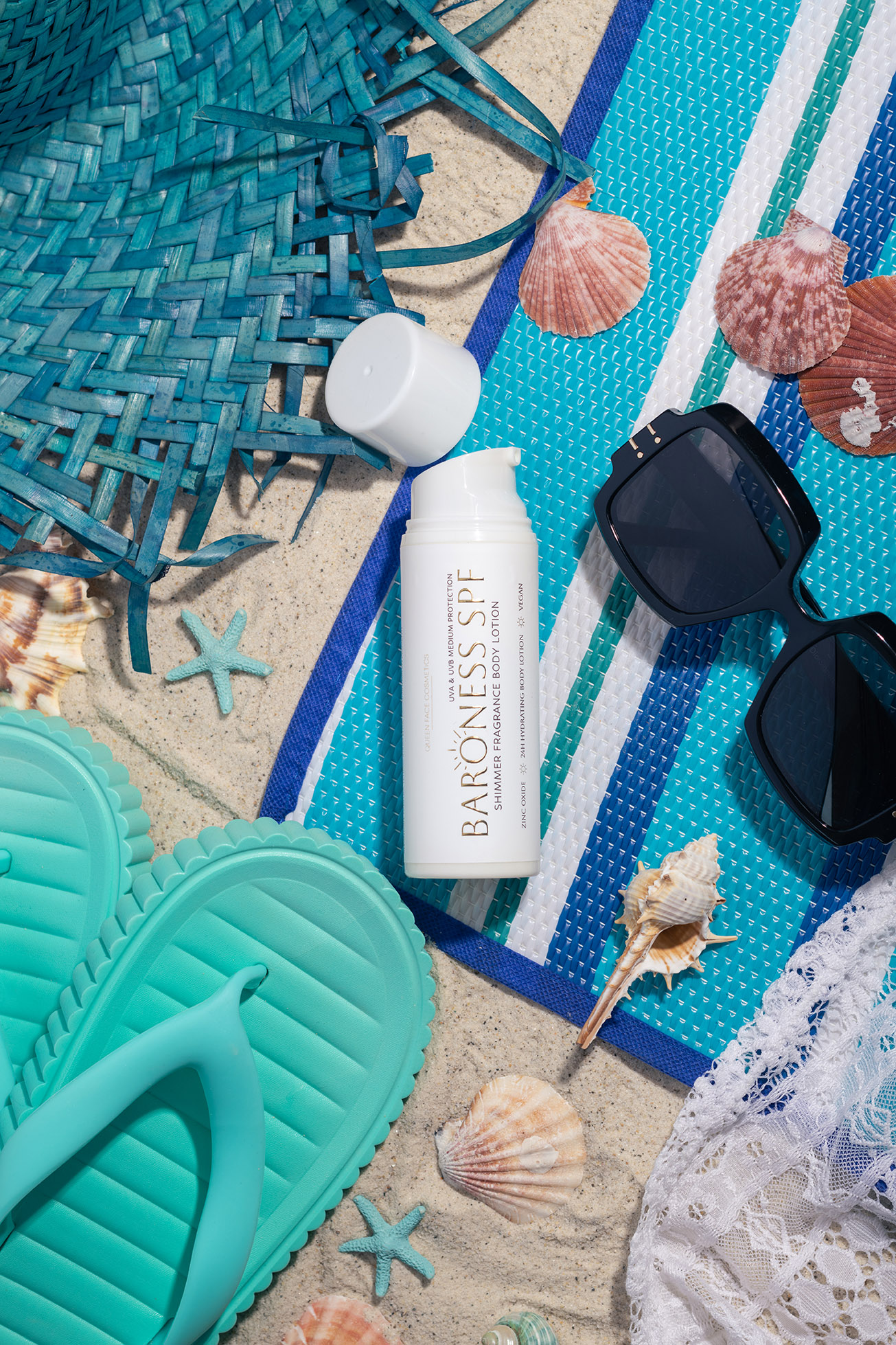
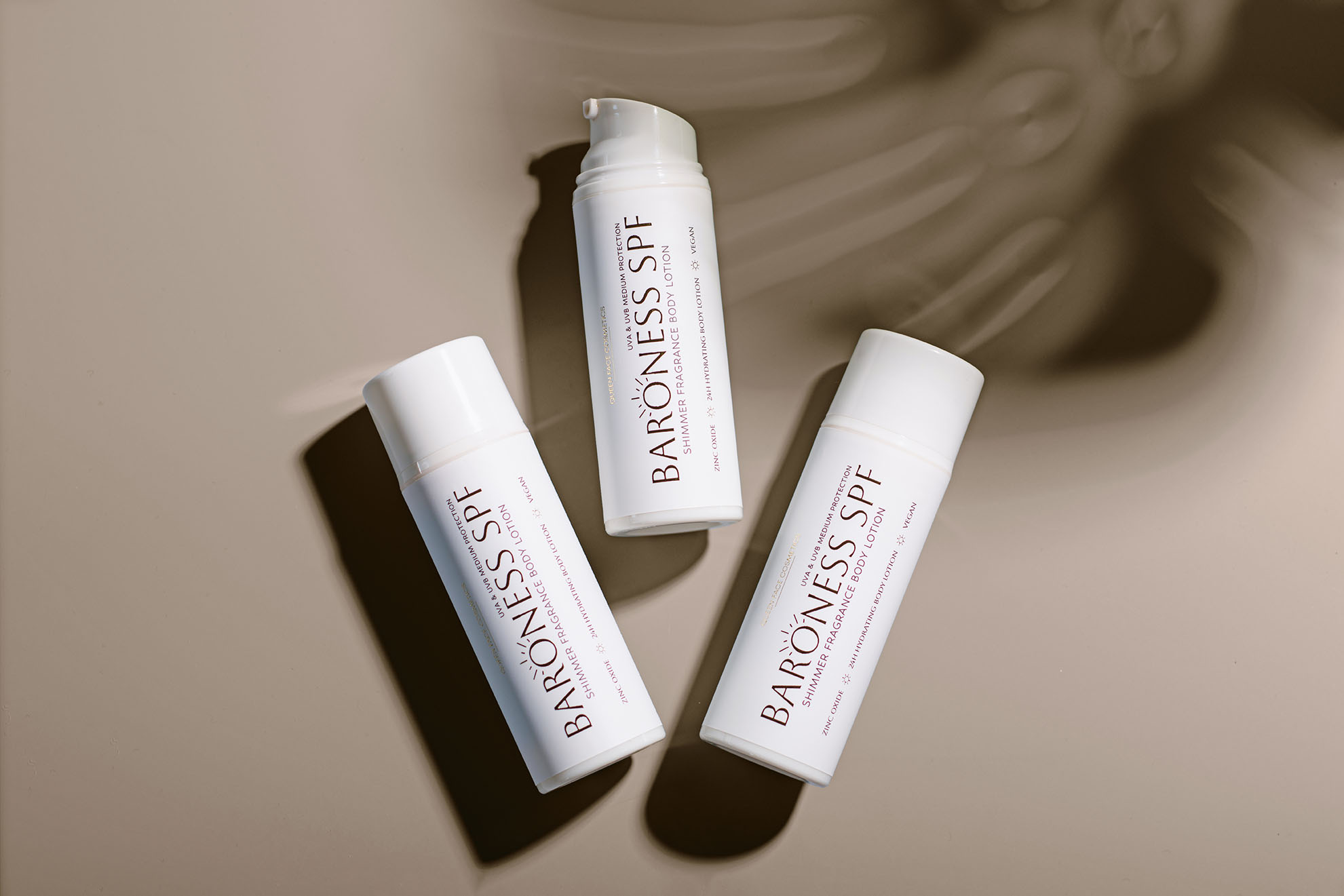
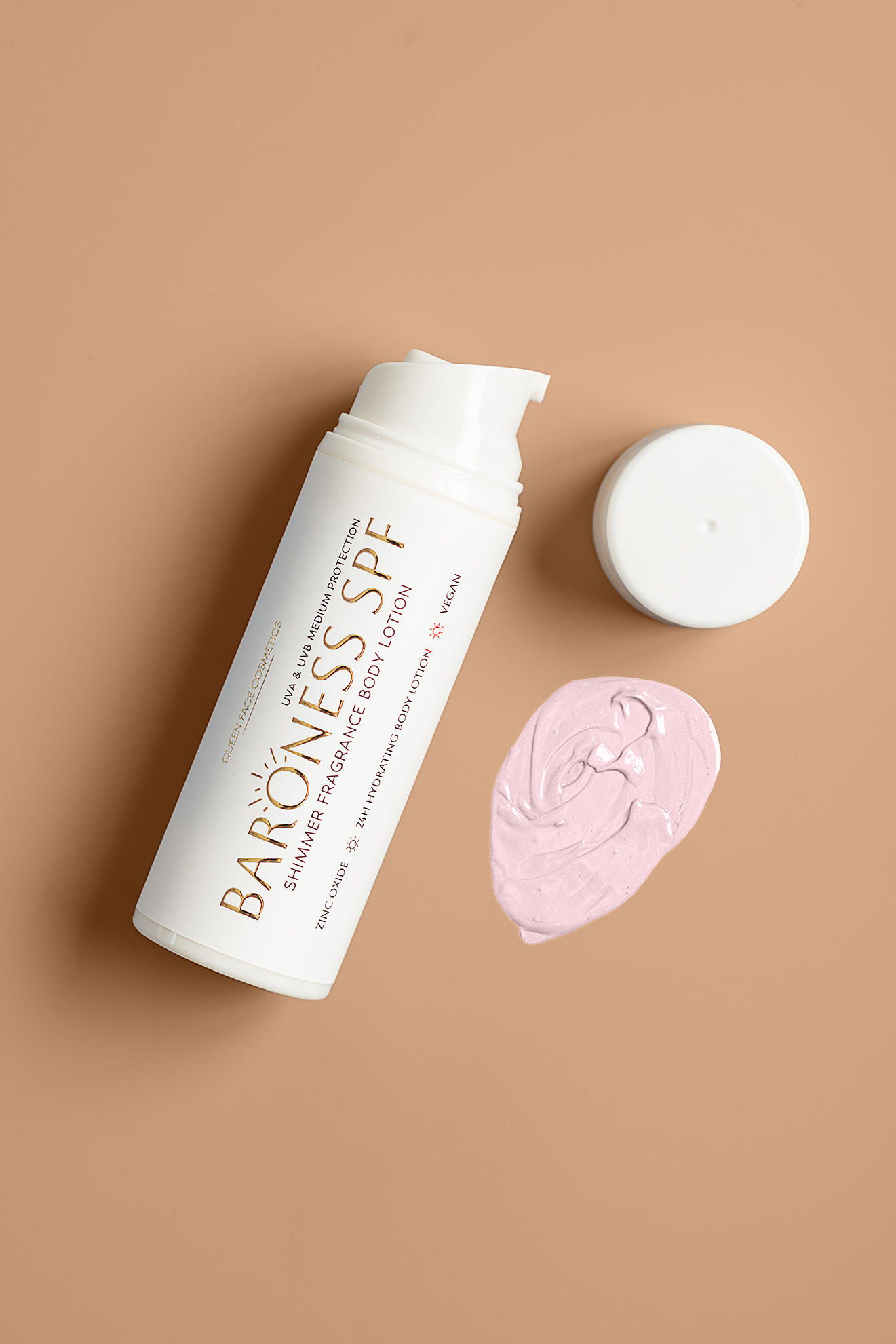
CREATIVE ART DIRECTION: Thematic set design and styling (Summer/Beach vibes) to highlight the product’s application and seasonal relevance.
HIGH-END RETOUCHING: Advanced color correction and surface retouching to ensure flawless textures and premium look.
THE CHALLENGE: “Queen Face” is a boutique skincare brand that stands for high quality and visible results. The challenge was to create a visual language that competes with established luxury brands. I needed to showcase both the “scientific” aspect (trustworthiness) and the “lifestyle” aspect (pleasure of use).
THE SOLUTION: I curated two distinct visual styles:
- Clinical Purity: For the anti-aging creams, I used a minimalist approach with harsh, clean lighting on a white background to emphasize the premium packaging and the “Superior” nature of the ingredients.
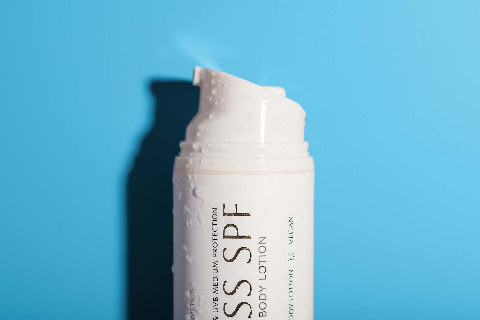
- Seasonal Mood: For the “Baroness SPF” line, I created a sensory experience using elements like sand, seashells, and water droplets. This transports the customer directly to the beach, associating the product with summer fun and protection.
THE RESULT: A cohesive visual portfolio that covers all marketing needs – from the clean online store catalog to engaging social media campaigns.